
Logo & Packaging Redesign,
In-House Graphic Designer
for Hismile
Hismile Rebrand & Packaging Design
T W O R E B R A N D S F R O M 2 0 1 9 - 2 0 2 2
Over several years with Hismile, I played a key role in shaping the brand’s creative direction as the sole graphic designer within a team of content creators. I led the execution of all visual design, developing key brand assets, creating packaging, and preparing files for production. I was instrumental in two major rebrands, including the creation of the current logo still in use today. My work also extended to special projects such as limited-edition accessories, ensuring cohesive and elevated design across every brand touchpoint.
T H E E V O L U T I O N
Logo & Packaging Design


2 0 1 4
Original Branding
The original packaging, designed in 2014, served as the foundation for the brand refresh. Developed by a previous designer.
2 0 1 9 R E B R A N D
Logo redesign
When I joined Hismile, my first task was to mood board and collaborate with the founders on a bold new direction for the logo, moving from the soft, lowercase original to a strong, all-uppercase design. We also refined the smile mark, removing the teeth and simplifying it for versatility.
Around this time, we launched the iconic pink toothpaste, which set the tone for a vibrant new colour palette. This marked the beginning of a visual shift as icons evolved, PR packaging became more playful and the team embraced bolder, more creative design choices.

2 0 2 1 R E B R A N D
Brand Strategy & Visual Refresh
Work collaboratively with the founders and other designs to reach this logo design, identifying a lack of emotional connection, an outdated digital presence, and limited Gen Z appeal. Insights from competitor and trend analysis informed a bold brand refresh. Introducing a striking new colour palette and cohesive visual system.
PAP+ Formula & Sub-Brand
We created a new, in-house PAP+ formula designed to work with upgraded light tech for more effective whitening. A distinct sub-brand was developed around PAP+, featuring a custom dot motif and packaging inspired by product components.
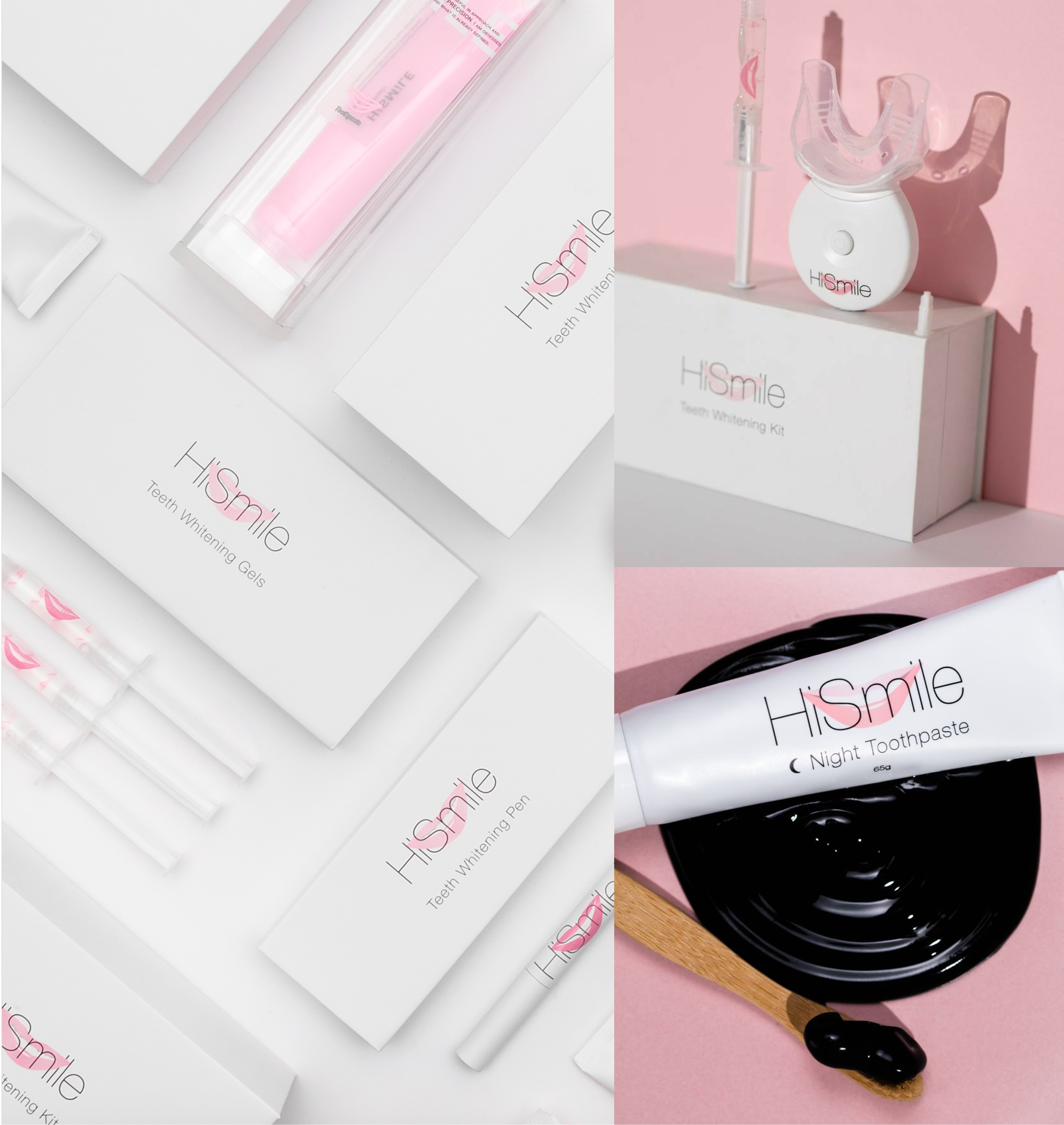
Whitening Kit Redesign
We redesigned the whitening kit with a completely new shape and visual design, both inside and out. The product was housed in custom-made moulds, elevating the overall look and feel to align with the refreshed brand identity.
Device Upgrade
Enhanced the mouth tray with additional lights to maximise PAP+ performance, delivering faster, more powerful results in a tech-forward market.
Logo & Packaging Redesign

2 0 2 2 P A C K A G I N G R E D E S I G N
Revised Teeth Whitening Kit & Pods Packaging Design
We revisited the entire whitening device, working closely with our in-house 3D engineer to reshape and mould it into a more distinctive, ergonomic form. Since we created our own custom device, we also upgraded the light technology switching from blue to purple light, which penetrated the PAP+ formula more effectively and enhanced whitening performance.
Alongside the device redesign, we updated the packaging to reflect the new brand direction. We also refined the PAP+ delivery system, replacing the original pods with easy-to-use tubes after feedback revealed the formula was difficult to dispense. These changes significantly improved both functionality and the overall user experience.
